Much of the appeal of the original iPod - aside from the graceful minimalism of its exterior design - came from its ease of use. The interface was uncomplicated, the click wheel made navigating through the UI a breeze, and it only improved further as the design progressed through further generations of the product.
But while the simplicity of that interface was well suited to the relatively basic functions of the device, applying the same UI paradigms to a slightly more complex device - like a phone - probably wouldn't have been the right approach.
Even so, Apple experimented in doing exactly that, developing a version of its iPod interface for early prototypes of the iPhone.
Noted blogger Sonny Dickson published a video and a series of photos showing that operating system in action - and as he pointed out, "Apple clearly made the right choice" when it decided to ditch those efforts and focus on developing the iPhone OS that eventually became what we know today as iOS.

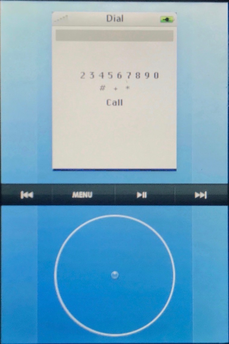
Sonny got his hands on one of Apple's earliest iPhone prototypes, which featured an aluminum chassis, 2G and WiFi connectivity, and a multi-touch display. However, the operating system was quite unlike iOS as we now know it, and much closer to the iPod user experience, with a virtual on-screen scroll wheel in the lower half of the display used to interact with iPod-style menus in the upper half, with the two portions separated by additional navigation controls.
The absurdity of this approach is best exemplified in screens like the phone dialer, in which users would still have to use the scroll wheel to select and input numbers, rather than simply tapping the number on the display as you would expect to be able to do on a touchscreen. One can only imagine the usability nightmare of writing multiple text messages in the same way.
As Sonny points out, the interface was known internally as 'AcornOS', but it's not clear if Apple ever intended to use that branding publicly.
Apple went as far as patenting the idea for this UI approach of menus controlled by an on-screen navigation controller, but thankfully, it eventually abandoned work on AcornOS, in favor of basing the development of the iPhone OS on its OS X desktop operating system.
You can see AcornOS in action in the video below:
And if you want some idea of what might have happened if Apple had really run with the idea of extending the click wheel across all of its products, The Onion is here to help:
Source and images: Sonny Dickson


6 Comments - Add comment