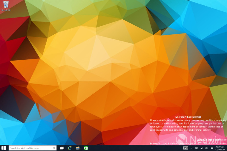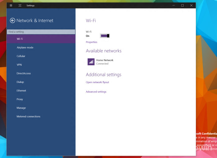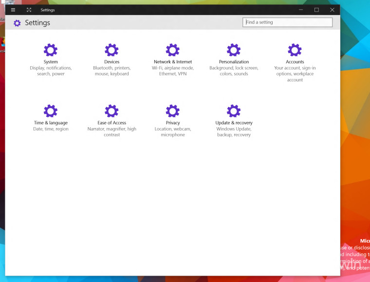
A new build of Windows 10, 9901, has leaked and with it, we have the best look yet at the new direction Microsoft is taking with the user interface. In this build we can see that the taskbar has been updated, the header bars in modern apps have been refined and throughout the UI, we can see enhancements.
Way back in July, we started talking about the 'distinctive' overhaul that Microsoft had planned for Windows 10 and now we can see that coming together. The taskbar, at least in this build, is darker and the header bars now have more modern looking close, minimize and max button.


There are also some very small updates too, for example, in modern apps, the hamburger button in the top left is now larger and the app icon is no longer present. This makes the UX a bit better and is a small, but welcomed, improvement.
The search bar, that could previously only be turned on with a registry tweak, is now showing up by default and, as we showed previously, is tied into Cortana. Cortana, in this build, is still quite limited and does not appear to be fully functional yet.

Deeper inside the OS, the settings app has been even further refined and shows a more modern design take as well.

Overall, we can see quite a few design changes in this leaked build that shows the direction Microsoft is taking for the OS. While there is still quite a bit of time before Microsoft's event that is scheduled for the end of January, this is a good look at the direction Microsoft is taking with the OS.
After getting a taste of the direction Microsoft is taking, do you like where the new OS is headed or do you like the current style better?


126 Comments - Add comment