On September 30, 2014, Microsoft announced Windows 10, thus changing the firm's operating system as we know it. Windows was going to be serviced, rather than being refreshed every few years. We've learned since then that this means biannual feature updates, along with monthly (sometimes more often) cumulative updates.
Indeed, Microsoft was done competing with itself with new versions of Windows. On July 29, 2015, Windows 10 launched, and it was promised that there would never be a Windows 11. Here we are, exactly three years later, when we would normally see the next version of Microsoft's flagship OS.
Since then, there have been five feature updates, including versions 1511, 1607 (the Anniversary Update), 1703 (the Creators Update), 1709 (the Fall Creators Update), and 1803 (the April 2018 Update). Much has changed, and a lot of the OS looks completely different from when it started out.
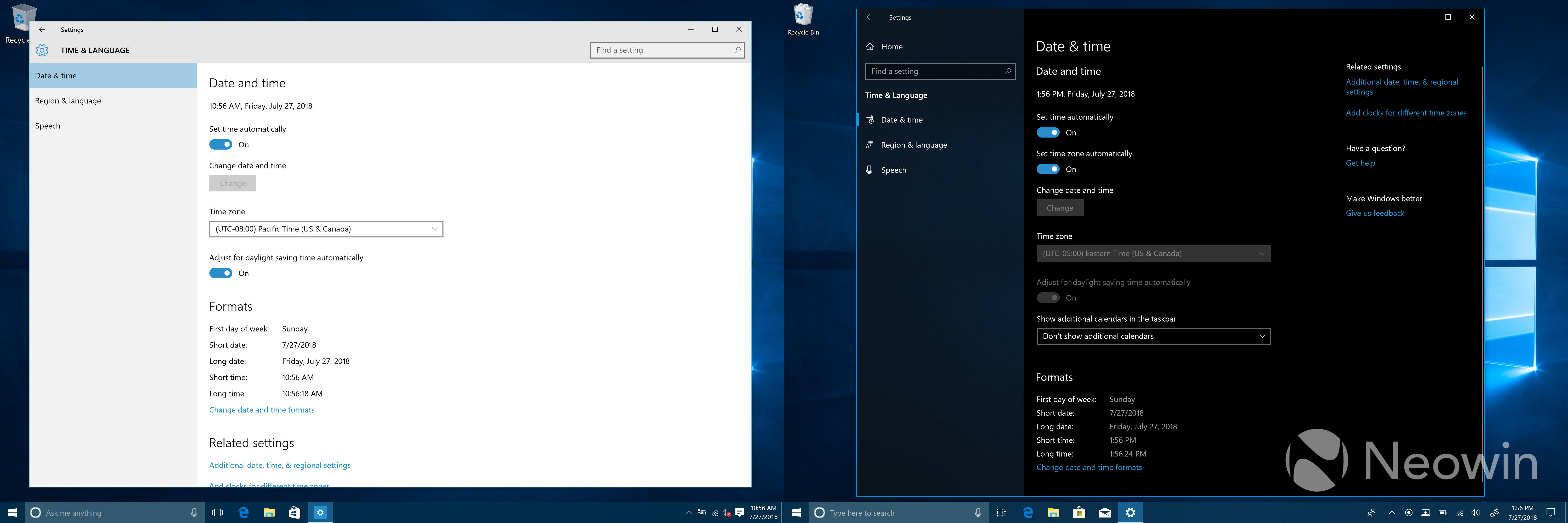
I decided to take a look back, comparing the original version (1507) to version 1803. Most of the changes are good, although some aren't. A ton of features have been added, such as the Windows Subsystem for Linux, Windows Ink, and more.
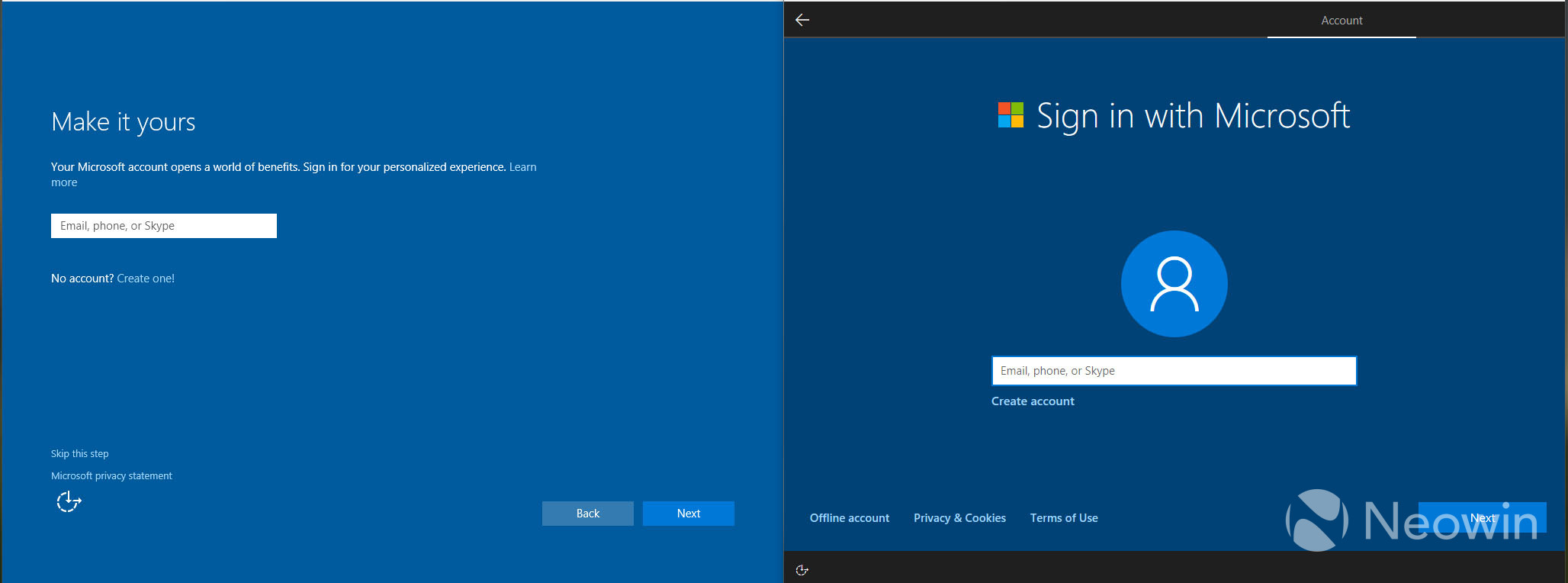
In the old days, the out-of-box experience was completely different, before Cortana took over the process.
Most of the options have changed, but Microsoft shows more privacy settings in the OOBE now.
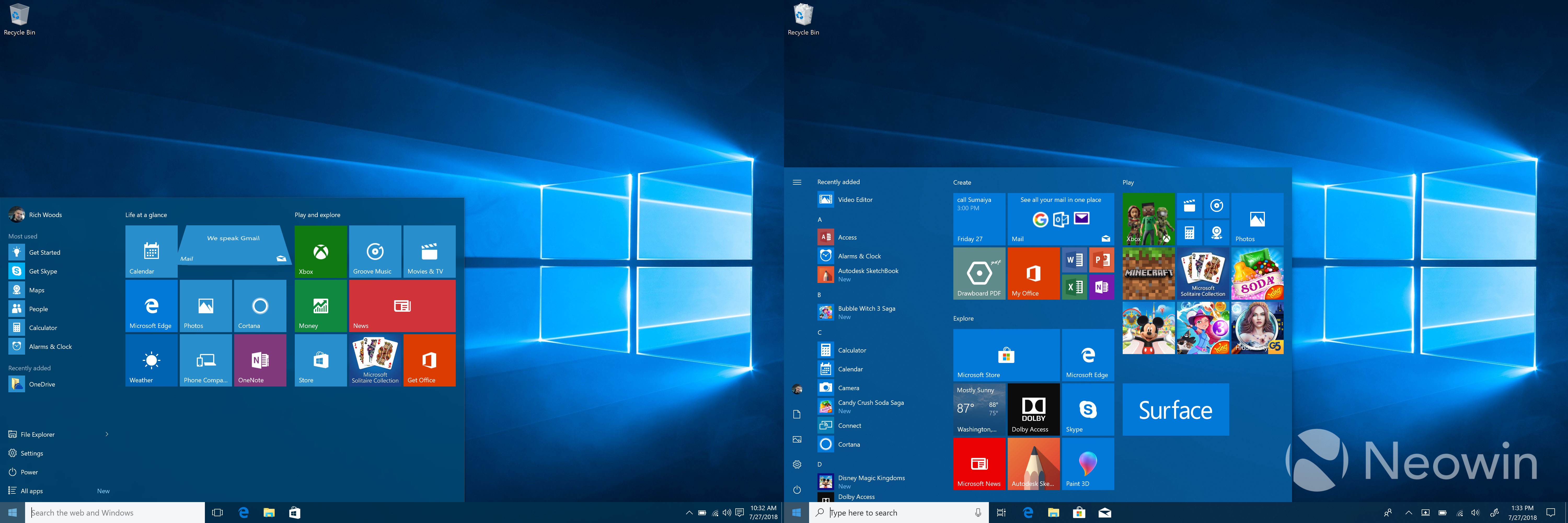
Probably the worst change that Microsoft ever made to Windows 10 was when it decided to install a bunch of crap on our PCs. In the old days, it was the OEMs installing useless software on your PC, and now it's Microsoft. New Windows 10 PCs come with Candy Crush Saga, Candy Crush Soda Saga, Bubble Witch Saga, and a bunch of other apps that no one wants.
After I installed the original version of Windows 10, this was the first thing that stuck out to me. The Start Menu seemed so much cleaner without all of those things that I hate.
And of course, the Start Menu itself has changed. You now see All Apps automatically.
The All Apps section in tablet mode has been expanded to make it a bit more touch-friendly when you want to see everything.
Starting with Windows 10 version 1607, dark mode is supported. This was actually a Windows Phone feature that went back for years, and it made sense to bring it to the desktop OS. Now, it seems like everything has a dark theme.
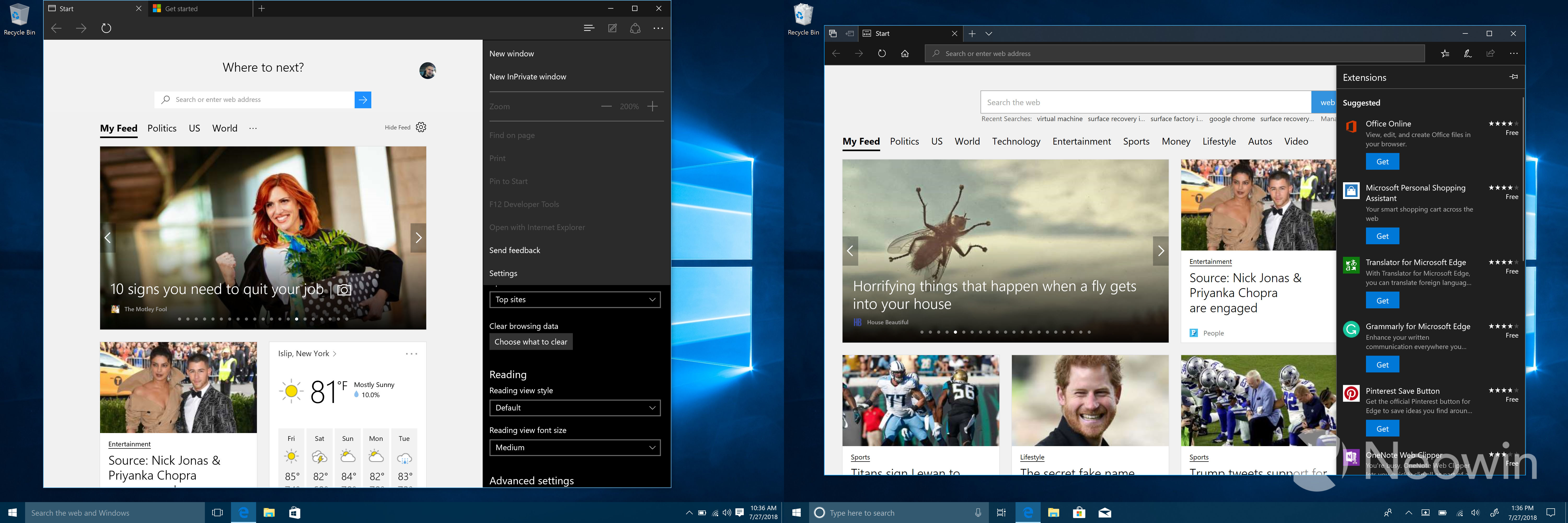
Interestingly, Edge always had a dark mode. What it didn't have, however, was extension support. However, even today, you have to change it manually, and it doesn't automatically set itself to the OS theme.
This also didn't arrive until Windows 10 version 1607. Indeed, the Anniversary Update was one of the biggest milestones for the OS in many ways. It also introduced features like Windows Ink...
This is Sticky Notes, a staple feature in Windows for years. With Windows Ink, it was replaced with a UWP app, but Windows Ink is so much more than that. You can draw in Ink Workspace, take handwritten notes in OneNote, draw routes in Maps, mark up images in Photos, mark up webpages and PDFs in Edge, and much more. If you have a PC with pen support, the Anniversary Update breathed new life into it.
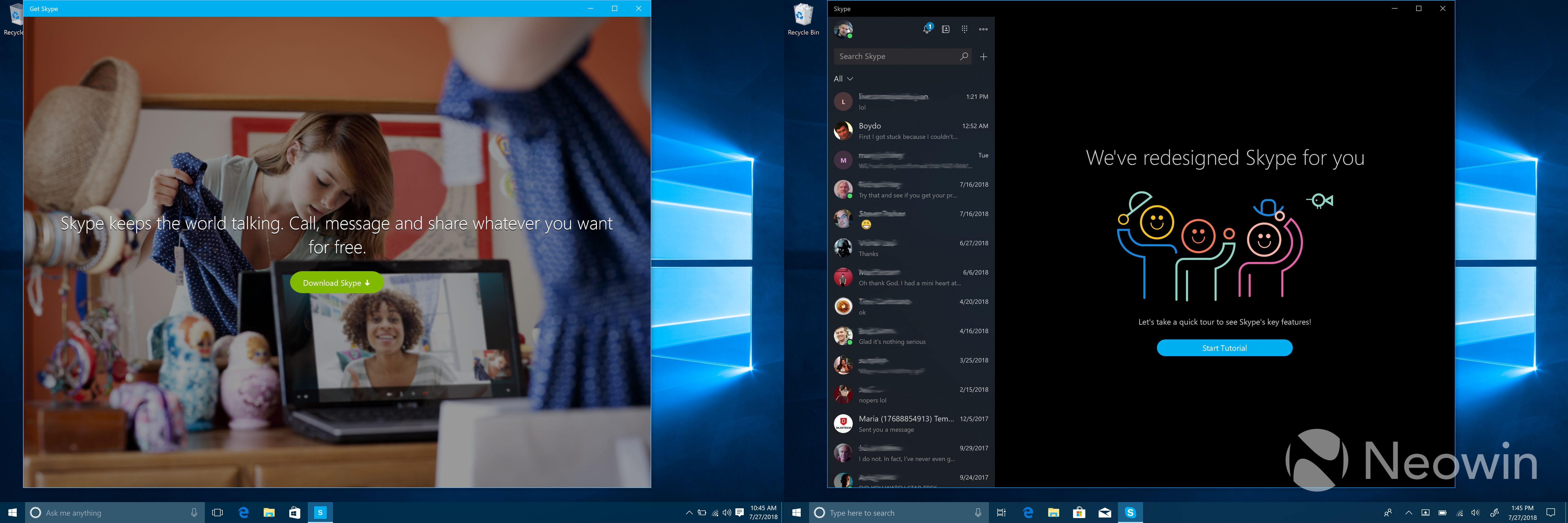
Hey, remember Get Skype? Yup, this app simply provided a link to your browser to download Skype. With the Anniversary Update, Microsoft introduced the UWP Skype app in preview form. But that wasn't before a brief period in Windows 10 version 1511 where Skype was split into three native apps: Messaging, Phone, and Skype Video. Oddly, that Messaging app remains, even though it doesn't do anything, and no, you can't uninstall it.
Get Office was a thing too. This served as a download link to Office 365. This app eventually evolved into My Office, which does actual things.
In the Windows 10 Fall Creators Update, Microsoft introduced OneDrive Files On-Demand. Before that, you had to choose which OneDrive folders to sync, and all of those folders would take up space on your hard drive.
Well, I say before that, but I mean before that on Windows 10. Files On-Demand was actually a replacement for placeholders in Windows 8.1. The feature was stripped out of Windows 10 when it was launched, and wasn't replaced until over two years later.
Cortana has changed a lot. Remember when it used to actually ask your name the first time you used it on every single PC you used?
Probably one of the biggest changes is Fluent Design. The most noticeable effect of the Fluent Design System is called Acrylic, which is the transparent blur that you see in the image above. Other effects include Reveal, which lights up nearby buttons. It's all meant to provide one experience across different devices and form factors, from 2D to 3D.
Here's another example of Fluent Design, as Calculator was overhauled. Elements of the Fluent Design System can now be found almost everywhere in the OS, including the Start Menu, Settings, and every UWP inbox app.
Obviously, Windows 10 has changed a lot, more than I could ever put into a single article. I wanted to highlight some of the aesthetic changes, because it's really like a whole new operating system.
And to me, that's the most fascinating thing about it. We're three years in, and this is when we'd typically get a new version of Windows. But that's what we have. This is something that's completely different from what we started with.
Make sure to check out the rest of the screenshots below.
What's your favorite change in Windows 10 from when it started out? Let us know in the comments!








81 Comments - Add comment