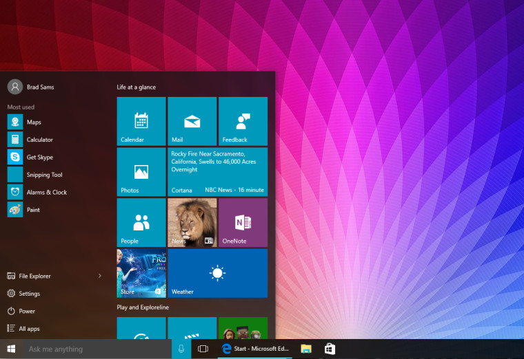
With Windows 10, Microsoft was looking to do away with many of the problems - and the resulting negative perception - of Windows 8, and one of the biggest steps in this direction was the return of the Start Menu, arguably the most popular piece of feedback on Windows 8.
Not only did the resurrected Start Menu receive the public's seal of approval but also that of the Industrial Designers Society of America (IDSA), which praised its UI as being both familiar and also modern and relevant to different devices:
Since its inception more than 20 years ago, the Windows Start menu has been the anchor point for launching apps and getting users to the content they care about. With Windows 8 and Windows Phone 7, Microsoft continued the evolution of the Start screen by adding live tiles which surface relevant and personal information to the user from apps and services. With the Windows 10 Start design, the experience of launching and switching apps is unified across the familiar and learned legacy of the Start menu on desktop PCs—and the modern capabilities of the Start screen on phones and tablets. The design allows users to leverage what they know from one device and apply that knowledge to using a different device in a contextually appropriate manner.
The company has, of course, been aiming for a 'fresh but familiar' outlook with Windows 10 and if this award is anything to go by, it certainly succeeded.
Source: IDSA


94 Comments - Add comment