Android is an operating system that captured the hearts of many, and continues to do so, but with the release of Windows Phone 7, a new contender has entered the ring. Windows Phone 7 is making some Android users green with envy, while others are turning their nose at the new platform. In this series, we're going to look at specific features of smartphones, and give a breakdown of which OS has the competitive edge in each area.
This series is written from a Android users' perspective, and aims to share how Windows Phone 7 might feel to your average Android user, and what may or may not appeal.
This second part of the comparison covers communication, and how Windows Phone 7 does this better (or worse) than Android. Be sure to check out the first part of the comparison for an overview of the basics.
Text Messaging
Texting is a huge part of most peoples' phones, and it's important to get the experience right. Android offers a feature rich text message client, and Windows Phone 7 offers a simple, but functional client instead. Both platforms use threading, which is essential on new phones.
Android offers conversation view, with the contacts name, as well as Facebook or Google Contact picture appearing next to their name. While the integration of pictures and all this information can be appealing, the design isn't exactly attractive, and can feel very cluttered. Notifications are shown across the top bar, with a preview of the message before it hides away as an icon.
One of the frustrations I experienced with Android is the default messaging application can be slow, clunky and generally inconvenient, especially so when message totals climbed above 300. This was mainly down to Android 2.1, and admittedly, 2.2 fixed this to some degree by allowing automatic clean up of messages over a certain limit, but still, if you have a large number of threads, the application can slow to a crawl.
Windows Phone 7 somehow manages to circumvent the application being slow, while retaining massive amounts of messages. I've sent and received around 400 messages over the last week, and the application has retained it's original speed, which is brilliant.
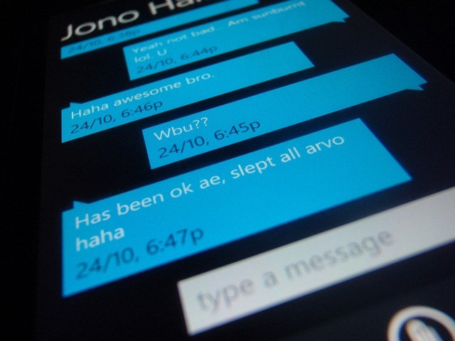
The messaging client on Windows Phone 7 is simple and sleek, and fits in with the entire OS. Speech bubbles pointing down represent you (pointing towards the user) and speech bubbles pointing upwards represent the other party. No names or images are used here, except at the top to indicate who the messages are to. If you click this you're thrown through into the contact's details.
The simplistic design can be confusing though. The messages are exactly the same color, and sometimes at a quick glance can take a while to decipher, until you catch on to the way the boxes are pointing. This took me a while, as I'm so used to the way Android uses contact pictures to identify the other party.
Notifications are similar to that of Android, except they slide down in a visor style.
Windows Phone 7 wins this section due to its simplistic nature, with the client being easy to use, as well as fast. The latter being an area that Android can stumble in. If it weren't for this factor, it's likely Android would be on top, as it's customizable to the heart's content, but speed is everything when you're writing only 160 characters.
Winner: Windows Phone 7.
In a smartphone, email is as essential as texting, and getting the experience right is critical to how efficient it is to email off of a device.
As a long time Gmail user, I'm obviously used to conversation views. The way Windows Live presents itself doesn't make sense anymore, and I'm used to seeing email laid out all in one, rather than having to flick between messages to find content. For some reason, Microsoft didn't bother with conversation view in Windows Phone 7, instead opting for single message viewing only. It seems like a poor design choice right now, with even Outlook 2010 supporting message threading.

Android's built in Gmail client has threading, just like the web interface, which makes it superior for phone usage. This is great, but the email client also seems to suffer from over cluttering, as seen in the picture below. Android can be seen on the right, with Windows Phone 7 on the left. This is partially due to the smaller Android device I own, but even on larger devices, such as the Nexus One, it still feels like there is too much going on, distracting from the actual email content.
Both devices display the HTML content correctly, but Android lacks the ability to zoom in or out of the email, making it a bit of a hassle to view the entire email. Windows Phone 7 supports pinch to zoom here, so you can zoom in and out easily, as necessary.
Windows Phone 7's animations in the email application are fast and classy, with the message flying off when sent. It's odd that the system wide color scheme doesn't come across here, but it does make sense, considering having the background black may make the emails harder to read. Also, the phone supports a huge range of accounts natively, including Exchange, Yahoo!, Gmail, Windows Live, IMAP & POP.
For this section, the winner is hard to decide. The minimalistic nature of Windows Phone 7's email client is brilliant, and it feels great to use, but the lack of conversation view is frustrating. Android has conversation view, but the interface is so busy and very distracting. The other annoyance with Android is sync can be unpredictable and very slow at times. When a sync is initiated, it can take a long time to update the inbox, this may only be personal experience, but it is very off putting when on the go.
Windows Phone 7 wins here for four major reasons; HTML email is much more useful with pinch to zoom, offers a large amount of built in accounts, sheer speed and the minimalistic interface.
Winner: Windows Phone 7.
Social Networking
Social networking is a huge part of many phone users' daily life, and decent integration can make the phone experience much nicer.
Android and Windows Phone 7 try very hard in this area. Android doesn't come bundled with Facebook functionality, but installing the Facebook application from the marketplace allows contact information to be synchronized with Facebook to grab photos and other missing contact information. After this, the latest status update of the user is shown in their contact, as well as a link to their profile (which goes to Touch Facebook). Once installed, the application can be configured to check for notifications, and notifies the user using the notification bar when they have new messages or wall posts.
Windows Phone 7 tried very hard to bring this integration into the core even further. Facebook is built right into the phone, and nothing is required to download to start syncing. Adding a account will automatically synchronize the contacts with your address book, and bring their posts and updates with it.
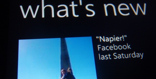
The Facebook integration at this point is beautiful. You can go into the “People Hub” and view the newsfeed, and you can open individual contacts and view a newsfeed from them, as well as being offered the ability to post on their wall directly, and interact further with ease. The odd thing here is that there's no central place to view notifications, and there's no actual notifications from Facebook itself, unlike Android.
There's actually a Facebook application for download from the Marketplace that gives further functionality, such as the missing “notifications” but these aren't actually pushed to the user. It doesn't even have a live tile. You have to actually open the application (which can be slow) and go check them yourself, which is very, very frustrating. Below is a quick overview of the Facebook application, the OS wide integration and its pros and cons.
On the Android side of the fence, Facebook doesn't come without problems. From time to time, you'll try to perform an action, view a status update or photo, and you'll be thrown out of the application onto the "Touch Facebook" web version. This odd behavior can be frustrating when trying to find information or browse a profile.
The same problem exists for the Windows Phone 7 Twitter application, but the OS itself doesn't support Twitter out of the box yet. Here's hoping this is added at a later stage.
Both mobile platforms have severe issues in these areas, Windows Phone 7 excels with integration of Facebook enabling almost any activity quickly, providing you aren't looking to get notifications. Android excels because it has notifications and the app works generally quite well, but falls down severely thanks to it's reliance on the "Facebook Touch" version of the site. These problems considered, neither platform is better than the other right now, both issues are just as annoying as each other.
Winner: It's a Tie.
This post is part of a week long series featuring Windows Phone 7 called "7 days of Windows Phone 7", and is a deeper look into Microsoft's much anticipated re-launch into the smart phone market. To follow the feature week, make sure to check out the "7 days of Windows Phone 7" tag. Check back later this week for the final part in this series.


147 Comments - Add comment