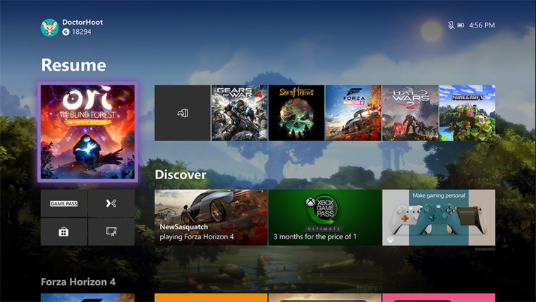
Back in July, Microsoft announced that it's redesigning the Xbox One dashboard. While Insiders were testing it out since then, the company rolled back the changes last week, saying that it's doing testing in phases.
Well, today it's back, Microsoft's Brad Rossetti announced. It's the beginning of the next phase, and it's still limited to 50% of Insiders on the Preview Alpha ring.
The new home screen is designed to removed the tabbed interface that we're curently familiar with on the Xbox One. Those tabs are replaced with buttons, which should make for a faster experience. After all, the console will no longer have to load all of the data from all of the tabs just to work.

Rossetti did not clarify what exactly has changed from the first phase, but we can see some changes from the screenshots provided. The top row of tiles has been shifted down to align with the bottom border of the large tile on the left, rather than the top border. That leaves more empty space at the top, and the 'Discover' text below that is gone.
This still isn't the final phase. It's likely that we won't see this roll out to everyone until the spring, and there will be several iterations before then.


6 Comments - Add comment