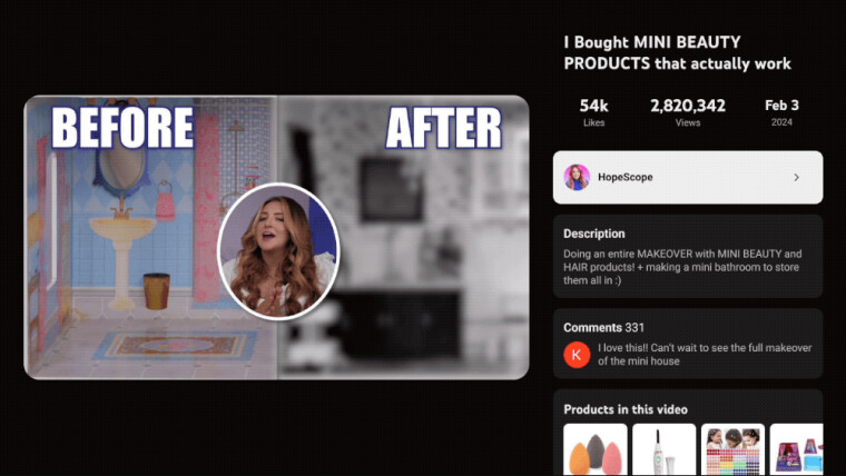
YouTube announced that it's rolling out a new user interface for its TV app to make it more interactive, while not eating too much into the "lean back" experience big screens are known to offer. Its updated design lets you watch videos in a smaller player and read the comments side-by-side.
In a blog post, YouTube explained that it tried multiple prototypes and analyzed user feedback to conclude that "obscuring the video would be detrimental to the viewing experience." YouTube's current design for its TV app shows comments and other UI elements on top of the video.

Rolling out over the next few weeks, our new design will not only improve existing functionality like accessing video descriptions and comments, but also open the door for a broad range of new experiences such as shopping for your creators’ favorite products and viewing live scores for sports fans.
Not just comments and descriptions, the new design helps you better utilize other features such as chapters, key plays, and shop for the products featured in videos. It also displays the number of likes, view count, and video upload date.
YouTube noted that watchtime on TVs has exceeded one billion hours per day. And while watching TV is widely considered a "passive experience," the company wants to help people engage with the content on the big screen, it said.

To see the new user interface, bring up the on-screen controls in YouTube's TV app while playing a video, then click on the title. The updated design also shows up when you click on the Comments button. However, after testing it on an Amazon Fire TV Stick 4K, it seems that the Play/Pause button on the remote only works when the video player window is selected.
Also, you can use the seek controls when the player is in full-screen mode. YouTube said it has plans to expand the feature by adding more interactive experiences such as multiview, fantasy view, and more.


7 Comments - Add comment