Motorola's Moto G family is always about providing the most value for your dollar, and because of this, it's become very popular. In fact, the company now makes the handset in four flavors. This year, there's the Moto G7, G7 Power, G7 Play, and G7 Plus. I reviewed the G7 proper a few weeks ago, and the G7 Plus isn't available in the U.S.
So now, I've got the Moto G7 Power. This handset's selling point is its 5,000mAh battery. But that's really about it. Everything else about it is sadly lesser than the regular Moto G7, and you only save $50 by purchasing it. So really, there are two reasons to buy a Moto G7 Power: you either really want the better battery life, or you really want to save those $50.
Here's our review:
Specs
| CPU | Qualcomm Snapdragon 632m quad-core 1.8GHz Kryo 250 Gold, quad-core 1.8GHz Kryo 250 Silver |
|---|---|
| GPU | Adreno 506 |
| Display | 6.2 inches, 720x1570, 279ppi, IPS LCD |
| Body | 159.4x76x9.3mm (6.28x2.99x0.37in), 193g (6.81oz) |
| Camera | 12MP, Front - 8MP |
| Aperture | f/2.0, Front - f/2.2 |
| Video | 4K - 30fps, 1080p - 60fps, Front - 1080p - 30fps |
| Camera features | PDAF |
| Storage | 32GB, expandable to 512GB |
| RAM | 3GB |
| Battery | 5000mAh Li-Po |
| Price | $249 |
Day one
Design
Sadly, the Moto G7 Power is going to live in the shadow of the G7, and there's no way around that perspective. In terms of design, the G7 Power is a bit more dull than the white G7's two-tone look. Also, it's a bit bigger, a bit bulkier, and a bit heavier.
One thing that I'll say for it is that it's not as heavy as you'd expect for a phone with such a large battery. It's actually pretty comfortable to hold.
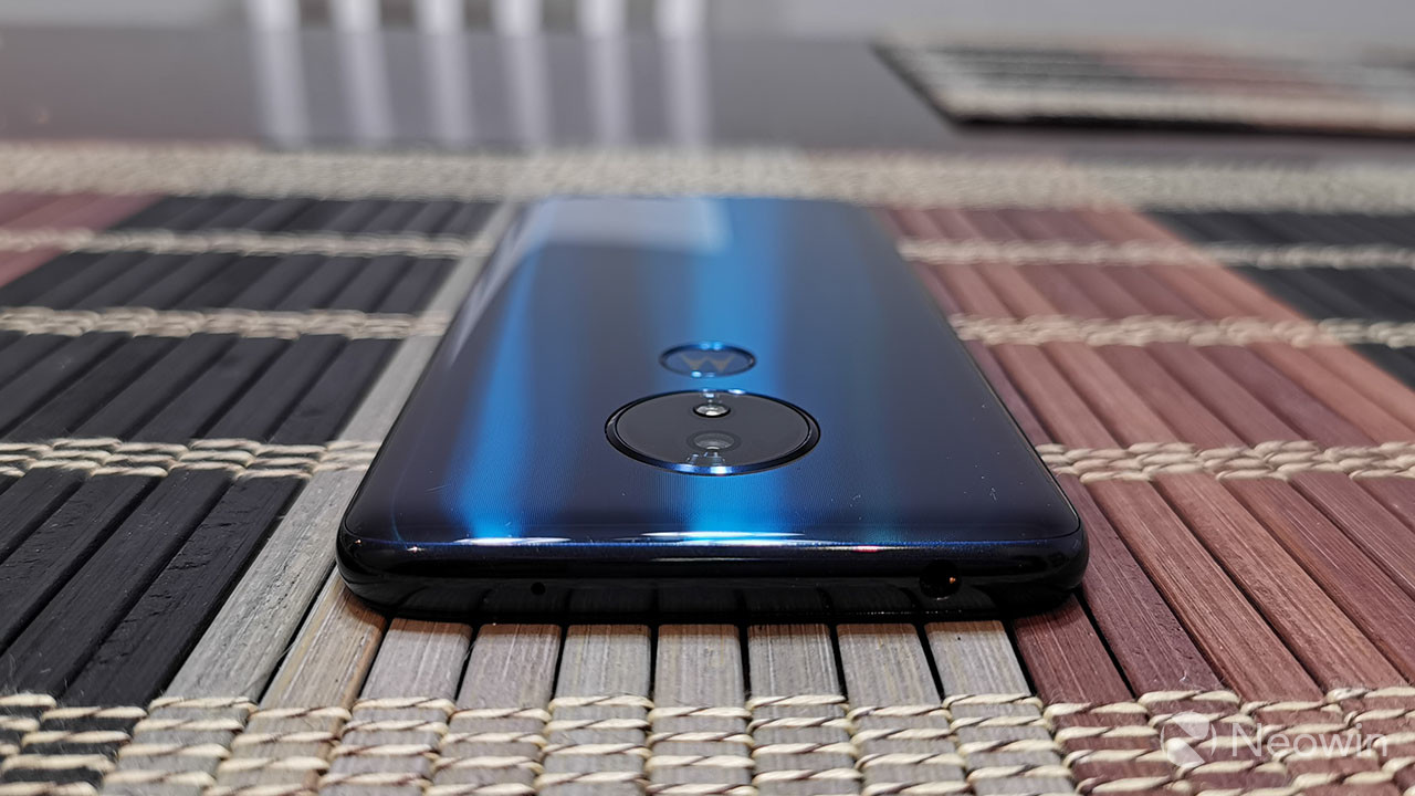
The model that was sent to me is Marine Blue, and that's the only one that's sold in the United States. The frame is a matching blue color, although like the G7, it's not actually metal. It uses a process called vacuum metalizing, which makes it look like metal, but there are no antenna lines.

As you'd expect, the phone is a glass sandwich, covered in a metallic shade of deep blue. In fact, the color is lovely. There's just nothing about it that gives it that pizzazz that I felt on the G7.
As has been the case for two years with the Moto G series - since it switched from aluminum - the glass back does not mean that there's wireless charging. When I asked why, the answer was simply, "Not at that price." I always have a problem with that answer though. If you're not going to include wireless charging, what's the point of using a material that's more fragile than metal or plastic. It's simply prettier.
The Moto G7 Power is 9.3mm thick and it weighs in at 193g, and that's all to compensate for the larger battery. That does make it a bit bulky, but one thing that's really nice is that it has a much smaller camera bump than the Moto G7. And like I said, it's bulky in comparison with the Moto G7; we do have many other phones that are heavier. The point is that you're not exactly going to have a problem carrying it around.

Underneath that camera bump you'll find the indented Motorola logo, which looks quite nice. It's blue with a silver logo, and this will be your fingerprint sensor. Personally, I think it's a stylish way to implement a fingerprint sensor, and it's the same on the G7. Sadly, the $199 G7 Play does not have one.

On the right side of the device, there's a power button, and above that, a volume rocker. The left side of the phone is where you'll find the nano-SIM/micro-SD slot. On the bottom, there's a USB Type-C port for charging and on top, there's a 3.5mm combo audio jack.

This misses a few things that are on the Moto G7. For one thing, there's no speaker grille; the only speaker is the earpiece, which surprisingly seems to be loud enough. The speaker does sit in the notch, which is larger than on the Moto G7. The G7 had a teardrop notch, while this is larger. In general, it has larger bezels all around the screen.

Also, the Moto G7 proper has the USB port and the 3.5mm audio jack on the same side, which always seems like a good design idea. If there's a possibility that you're going to have two cables plugged into a device at a time, you want those ports on the same time.

And also, speaking as someone that made pizza for a living years and years ago, it's better to have both ports facing down in my pocket, as there would always be flour getting everywhere. This is a minor design issue, but what bugs me about it is that Motorola did it for the G7 and not for the G7 Power.
Display
The Moto G7 Play has a 6.2-inch 19.625:9 720P display, and this is while it all seems a bit too low-end. Compared to the Moto G7, which is $50 more and has a 1080p display, it also has a single-lens camera, less RAM, and less onboard storage.

For most users, 720p is fine, but you can definitely see the difference between that and 1080p. That difference is that you can see pixellation at 720p, and you can't at 1080p. 1080p would have breached that barrier that Apple calls Retina, where you can't see pixellation from an average viewing distance.
Other than that, the screen is actually quite nice. While the resolution is lower than I'd like, the actual color representation and the brightness is on point. I do wish for OLED on devices that offer always-on displays, but this is too inexpensive for that.

As I mentioned above, the bezels around the display are larger than they are on the Moto G7 proper, including a larger notch and a larger chin. The chin is where you'll find Motorola branding, which I always hate to see because it makes it look like that's the only reason that the chin is there.
Battery life
Now that we've covered the basics of the device, let's talk about its main selling point, and probably the only reason you'd choose to buy it over its more expensive sibling. That's the 5,000mAh battery.
Motorola says that you'll get days of battery life, and that's no joke. For the time that I used this phone as my daily driver, I had no trouble making it through two days on a full charge. In many cases, it still had over 25% left when I charged it up. Note that while the larger battery is partially responsible for this, it's also the lower resolution display, probably one of the reasons that Motorola went with 720p.
It also supports 15W TurboPower, as does the G7, although the G7 Play does not. With that, Motorola says that you can get nine hours of use off of a 15 minute charge. Note that this is speaking on charging from a dead battery. As with all quick charging solutions, it starts to slow down as the battery starts to reach capacity, to prevent the battery exploding, which it can do if it overcharges. Don't worry though; all smartphones shut down charging when it reaches 100% for that very reason.
I also ran some battery benchmarks with Geekbench 4 Pro. I don't often do this, as I don't believe in battery benchmarks. They so rarely reflect real-world usage. Nevertheless, it's the selling point of this smartphone, so I did it.
I ran both a partial and full test. The partial test runs for three hours and the full test drains the whole battery. It looks like the full test scored some extra points by switching to a battery saving mode when it hit 10%.
Camera
As usual, Motorola introduced new camera features to the Moto G series that were previously exclusive to the flagship Moto Z series, such as Cinemagraph. There's also portrait mode, which uses a blur effect for taking pictures of people. Because it only has the single-lens camera, portrait mode functionality is reduced. You can do things like Selective Black and White, where only the subject is in color, and you can't do Selective Background, which allows you to adjust it.
Portrait mode also works with the front camera, which is nice. And yes, you can adjust the blur while you're taking the picture. You just can't do it after.
Cinemagraph is a feature that allows you to capture a short video and select a portion of the field of view to keep the motion, while the rest remains still. While it's fun, as are features like Spot Color - which allows you to only keep a certain color in an image while the rest is black and white - I don't think these things are practical in real life. I've never found myself using them.
I'd rather the focus be on actual camera quality, something that Motorola has always struggled with. The camera itself is slow and clunky, and it's even worse in low-light scenarios; you know, the scenarios where most of our pictures are taken.
And while I'm not a big portrait mode guy, it bums me out that there's only a single-lens camera. Considering that this device is just $50 cheaper than the regular Moto G7, I feel like it just makes too many compromises.
I didn't really pick and choose which samples I included in this review, because I wanted to show how often you'll end up with a poor picture. You'll want to make use of tap-to-focus, as it won't do it on its own. And you'll want to make sure that your subject is still, especially in low-light.
Moto
Moto is an app that comes installed on all Motorola smartphones, and it includes settings for Motorola's custom features. Naturally, the G7 Power includes a near-stock experience, so all of the features that Motorola adds goes into this app, rather than mixing them into settings.
Moto is one of my favorite things. It's a really clean way of implementing these features. Sadly, the G7 Power is missing some of the features you'll find on the G7, such as Moto Voice.
The two categories left are Moto Display and Moto Actions. There are two features in Moto Display, including Attentive Display, which is meant to keep the screen on while you're looking at. The other is Peek Display, an ambient screen that will show up when you life or move the phone. You can interact with Peek Display, holding on a notification badge to open it. Sadly, Peek Display suffers from having an LCD screen, as you can tell that the whole display is backlit.

There's a lot more that you can do with Moto Actions. Some of the ones that I like to turn on is the screenshot editor. This allows you to immediately edit screenshots after you take them, or take a scrollshot, which scrolls through a screen to capture a particularly long page.
One-button navigation is another good one. It replaces the traditional navigation with a pill. You can swipe left to go back, swipe right to go to your previous app, swipe up for recent apps, tap to go home, and hold for Google Assistant. It's similar to Google's method for its Pixel devices, but without the back button.
I'm a big fan of Flip for DND, which puts the phone on do not disturb when it's face-down. This is always nice when going to sleep. You can also set it to silence your phone when you pick it up, if you're like me and you don't need loud notifications for too long.
Another one that's cool is fast flashlight, which turns on the flashlight with two chopping motions of the phone.
Performance
The Moto G7 Power includes an octa-core Snapdragon 632 chipset, 3GB RAM, and 32GB of onboard storage, with a micro-SD card slot that can go up to 512GB. In another example of outside of the U.S. getting everything good from Motorola (like the Moto G7 Plus), the European variant has 4GB RAM and 64GB of onboard storage, like the G7 proper.
In my time with the device, I can definitely say that I felt the lack of RAM. Most of the time, the performance is fine, but there are times when it struggles. And it's not like there are particular times when it struggles, like when using high-resource applications, although those struggle too. You'll just be doing something at times and realize that it's taking too long.
The Snapdragon 632 is a big improvement over the Snapdragon 400 series chips that were traditionally used in Moto G devices, with the exception of the Moto G4 series, G5 Plus, and the G6 Plus (also not available in the U.S.). Still, having only 3GB RAM hinders it a bit.
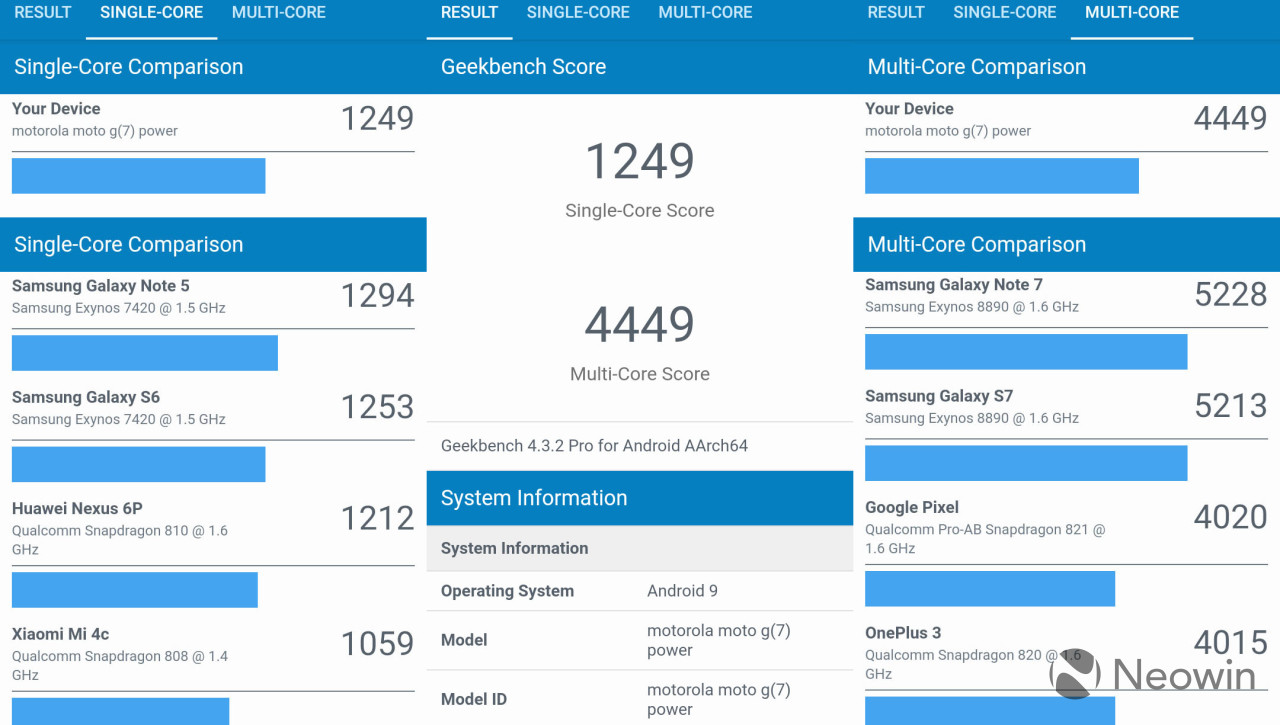
For benchmarks, I used Geekbench 4 Pro, AnTuTu, and GFXBench. First up is Geekbench 4 Pro, which provides a CPU test.
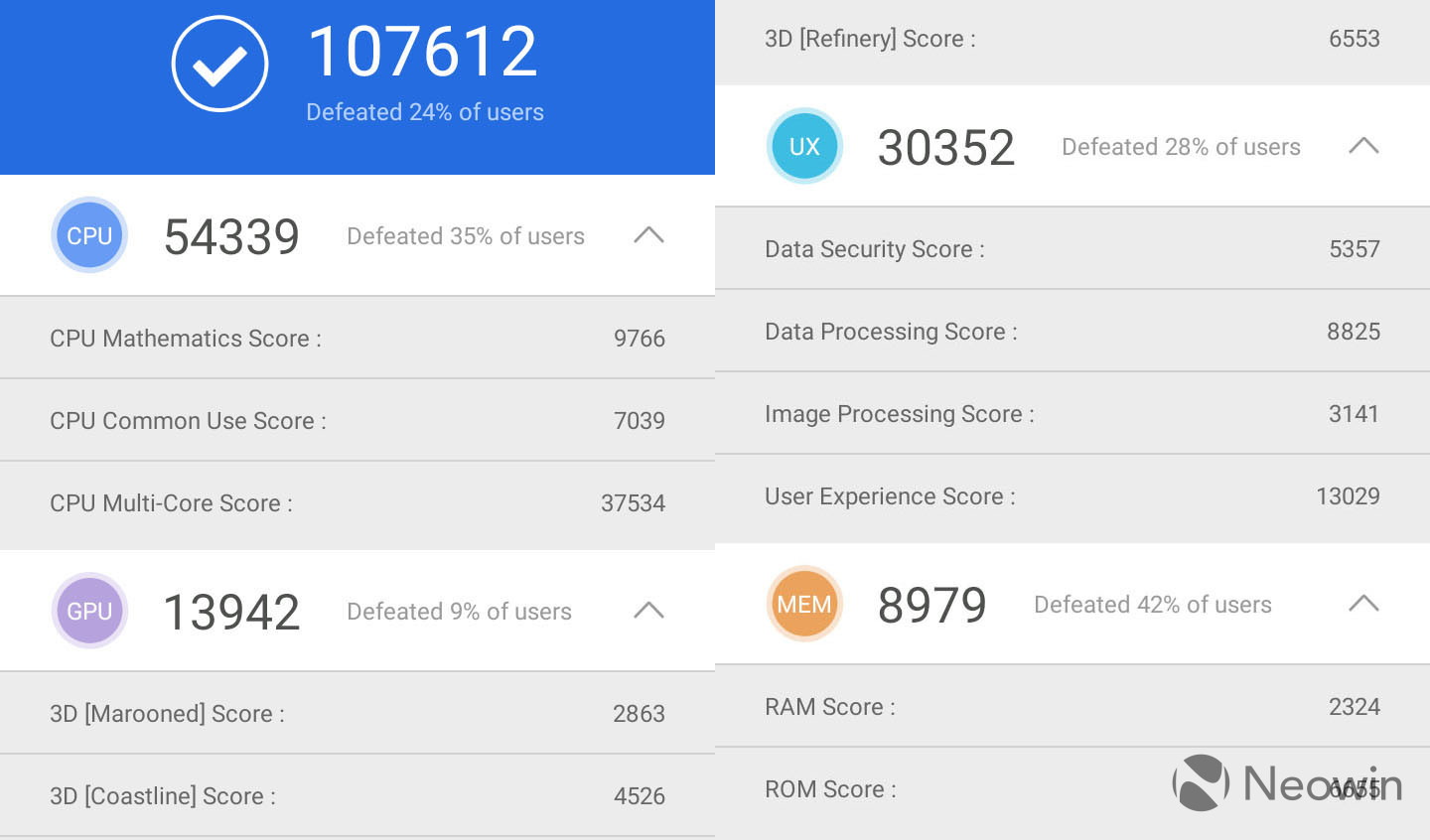
The single-core scores are comparable to flagship devices from about four years ago, and the multi-core scores are comparable to devices from about three years ago. Next up is AnTuTu, which has an all-in-one test.
The overall score was better than 24% of other users, and that's pretty much all that you need to know. Finally, GFXBench tests the GPU.
This is where you'll want to be aware of what types of games you're playing. If they're simple mobile games like Candy Crush or whatever, you're fine. Games that require a lot of resources, however, will struggle.
Conclusion
If the Moto G7 Power was the only device to come out from the G7 series, maybe along with the G7 Play, I'd say it's a solid device. But sadly, it sits aside the G7, which only costs $50 more. The Moto G7 is more stylish, has more RAM, has a better camera, has a better display, has better audio, and more. Motorola also still sells the Moto G6, which has a 1080p display, along with a 64GB storage and 4GB RAM variant, and that only costs $199.
The Moto G7 Power is all about that 5,000mAh battery, and that's what you really have to want. If battery life is your top priority by far, then this is the device for you. Otherwise, I highly recommend spending the extra $50 on the G7 proper. If that $50 is too much, go for the discounted Moto G6.

Everything else about this device is just...fine. The camera is mediocre despite some fun features, the display is pretty great, although a higher resolution would be nice, and the lack of RAM holds back the performance.
But still, it's a $249 smartphone with an all-glass design, days of battery life, and more. I just think that there are some better options from Motorola in the Moto G series, unless you're all about battery life. The Moto G series has always been about value for your dollar, and this device really isn't any different.
If you want to check out the Moto G7 Power, you can find it on Amazon here. For the Moto G7, you can find that here.


1 Comment - Add comment