Windows 11 Dev Channel build 22557 became available a few days ago, and we have started taking a closer look at some of the new features and redesigns it packs. This is being covered via the resumption of our Closer Look series.
A couple of days ago, we talked about the ability to create App folders in the Start menu being a welcome change, and today, we are going to walk through some of the changes introduced to Task Manager in the same Dev Channel build.
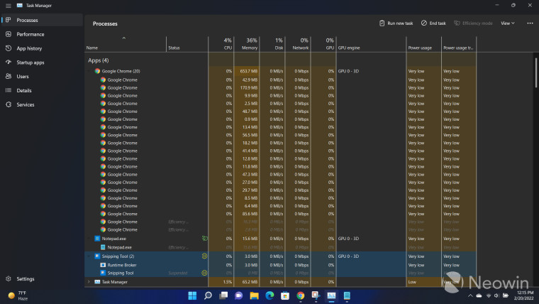
First up, you'll notice that Task Manager has gone through a major design revamp. This includes a few notable features. The first is that the app finally respects your system theme, so if you're running dark mode, you'll see the app in the same theme as well. This is a very welcome change and ensures consistency. Secondly, the content that was previously present in tabs has been moved to the left as a hamburger menu with new icons. I find this to be a very user-friendly change and it's in line with the Windows 11 design language as well. Some options have been moved to the pane on the top but most of them can be accessed from the right-click context menu too.
While we are on the first page of the Task Manager as can be seen in the screenshot above, it's worth talking about a couple of new functionalities as well. Back in April 2021, Microsoft introduced "Eco mode" in the Windows 10 Insider Preview, and this is making a return in Windows 11 as "Efficiency mode". As the name suggests, this setting basically allows you to limit resource consumption of individual processes through their associated context menu or by clicking on them and then tapping on Efficiency mode on the options pane at the top.
You can make use of other common controls such as End task and Run new task directly from this UI as well. You can also click on the View button to group processes, expand them, or collapse them. It's quite nifty to have these settings at your fingertips instead of navigating between drop-down menus as is the case with the generally available Task Manager implementation, so I appreciate this change too. That said, this interface is clearly under development as the three-dots menu on the options pane at the top does nothing right now except highlight the options section, which is a bit of an unfamiliar behavior.
It is important to note that Efficiency mode can't be enabled for process groups, you have to apply them individually. Processes running in Efficiency mode show a green leaf symbol while processes that are suspended should a red pause icon. While it may seem obvious in hindsight, your process group won't show the green leaf symbol until all its associated processes are running in Efficiency mode. For example, in the screenshot above, I have two Chrome processes running in Efficiency mode but both the individual processes or the process group don't show the green leaf symbol. Meanwhile, Notepad only has a single process so putting that in Efficiency mode immediately shows the green leaf symbol next to the process group too. This took me a while to figure out as I expected to see the symbol next to individual processes too.
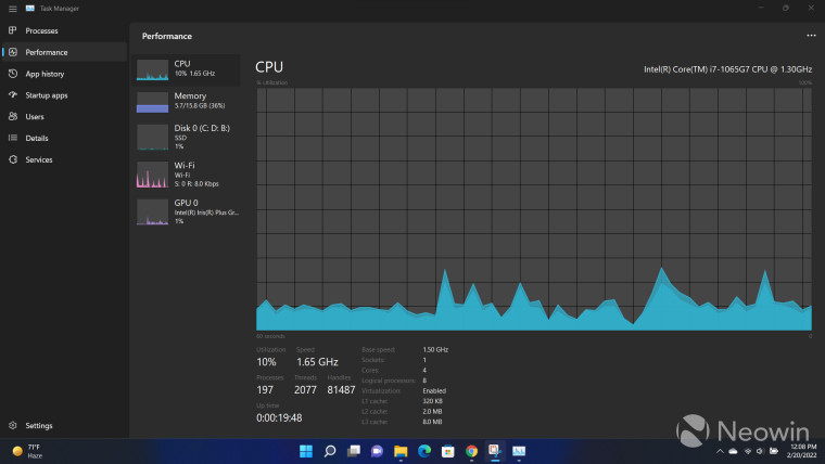
The Performance page is mostly the same. Although the shaded area under the CPU utilization curve does look very nice and modern, especially in dark theme. The Copy and Resource Monitor options have been moved to the three-dotted menu at the top, but otherwise, it seems to be the same in terms of functionalities.
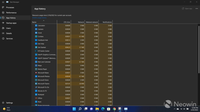
The App history page is mostly the same, but you will notice an Open app button in the options pane at the top, which is once again, nice to have at your fingertips in some use-cases. The three-dotted menu doesn't do anything right now.
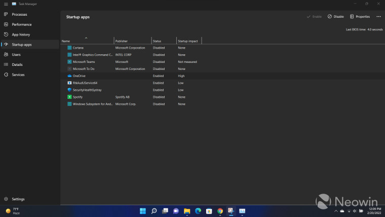
The Startup page has been renamed to Startup apps, which makes sense to me. Functionality-wise, it appears to be the same as the current implementation, with some common controls moved to the top options pane. The three-dotted menu expands to show two configurations, namely Open file location and Search online.
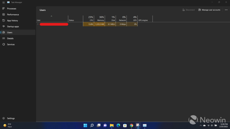
The Users page is the same too but some common controls have been moved to the top. The three-dotted menu has the same options as the previous Startup apps page.
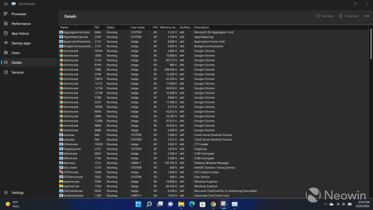
The Details page is the same but the three-dotted menu doesn't do anything.
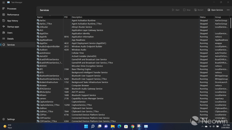
Functionality-wise, the Services page is the same but the common controls have been moved to the top and the three-dotted menu has two options, namely Go to details and Search online.
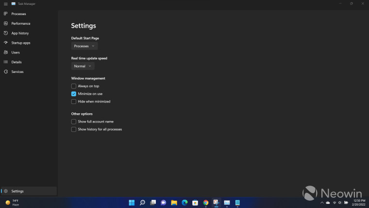
Finally, we have a dedicated Settings menu too. This is something I really like as previously, these options are currently hidden behind drop-down menus. I think it makes complete sense to have a dedicated section for them and I think this is a very user-friendly and clear implementation.
All in all, I'm a fan of most of the changes that have been to the Task Manager in Windows 11 Dev Channel build 22557 right now. Sure, the UI isn't fully consistent yet as some three-dotted menus don't even serve any purpose right now, but these are definitely steps in the right direction. We finally have dark theme and we finally have a UI that is more modern than the current legacy implementation, at the very least. It is also important to note that this is a Dev Channel build in which Task Manager will ideally be polished further before it is pushed to stable releases.
I only have one slight concern right now, and that is performance. Currently, swapping between different pages has a minor and nifty animation, but I have noticed at times that there is a slight jitter when I'm moving between pages or when I bring the Task Manager window back in focus after I have navigated away, which can be a bit jarring. I hope that this is something that the Windows development team can resolve before this hits general availability. But once again, this is an Insider build, so here's to hoping that Microsoft improves this further.
Have you tried Windows 11 Dev Channel build 22557 yet? What do you think about the Task Manager revamp?


17 Comments - Add comment