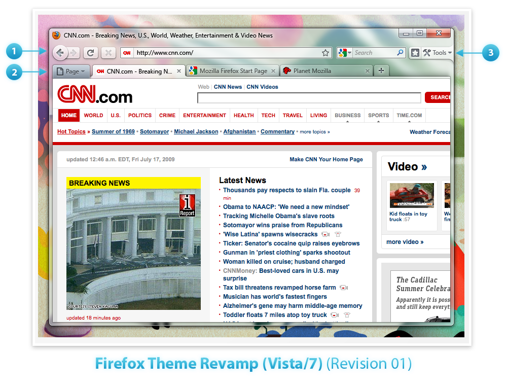
Mozilla's popular Firefox browser is on the up and up; with version 3.5 recently released, it's making very good progress, and now, the organization has revealed some concepts for a redesign they plan to be included in version 3.7.
Firstly, we should note that these new designs are purely ideas, and they'll only be re-making the Windows versions, so put your excited faces away, Mac and Linux users. According to the official wiki that we linked above, here are Mozilla's planned new improvements:
1. Embracing Glass: Toolbar and Tabs using Glass. Buttons translucent and slightly glossy to meld with the toolbar. Raised 3D lookachieve tactile "feel".
2. Page Button: Connect the Page button to the left side of the tab area. Directly connected to the Page.
3. Tools/Bookmark Bar: Connecting the Tools button to the side of the window to emphasize the fact that it is used for customizing and changing the UI. Adding a button next to that to toggle the Bookmarks bar which is turned off by default.
All this chat is well and good, but we know what you're really here for... the actual screenshots. Without further ado, here they are!
-001.png)
-001.png)


179 Comments - Add comment