_story.jpg)
Windows 11 became generally available over a month ago but it's been rolling out in a staggered manner so not everyone has received it yet. We've been taking a look at a lot of the OS' notable features as part of our Closer Look series in case you want to have an in-depth look at the smaller upgrades and changes.
Now that we've discussed most, if not all, of the new capabilities of Windows 11, I'd like to talk about my top five favorite updates. I also want to emphasize that the list below is not in descending order, rather, it's just a collection of five items that I appreciate because they improve my workflow and user experience. Not everyone else may feel the same way about them. With that said, here we go!
1 - Snap Layouts and Snap Groups
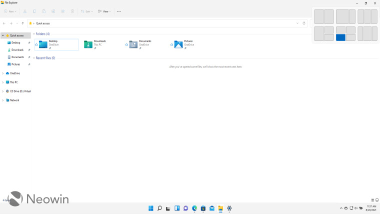
This is the easiest pick of this list for me. While Windows 10 allowed you to snap windows to the corners of your screen using Win + directional keys or by dragging the window to an edge of the screen, it could be a bit cumbersome when you're trying to arrange more than two screens. There was also a bit of asymmetry in the four-window layout that annoyed me and I generally found it unreliable in terms of getting the windows where I want them to be in a manner of seconds.
Windows 11 vastly improves upon this with the use of Snap Layouts and Snap Groups. The former allows you to hover your cursor over the "Maximize" button on a window and the OS will show you possible positions to snap it to. It also offers different layout options depending on the resolution of your display. You can then arrange different windows in a layout and have them open or close with a single click as a "Snap Group". It's extremely convenient for my use-cases and fixes a lot of the pain points that I had with the Windows 10 implementation.
The implementation in Windows 11 is inspired by that present in Microsoft PowerToys, and while it's not perfect, I think it's a huge improvement over Windows 10. You can check out my detailed thoughts on the topic here.
2 - Microsoft Store redesign
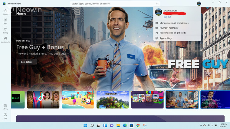
Okay, so I'll say it right off the bat, the Microsoft Store revamp is not specific to Windows 11. In fact, it just started rolling out to Windows 10 users a couple of days ago. However, since it made its debut with Windows 11, I think it fits in my list for the things that I love about Microsoft's latest OS.
The Microsoft Store in Windows 11 features a fully redesigned UI built from the ground up by Rudy Huyn's team. You can see an example of this in the screenshot above where the landing page is brand new and is now very aesthetic, in my opinion. There are some very neat and subtle animations and design practices being followed that make for a very satisfying experience.
The settings pages have been simplified and are less cluttered. The dedicated store listings now show more important information at a glance and just present a very neat view overall. Again it's not perfect - and let's face it, no software is - but it's a very pleasant app to use compared to the relatively dull Windows 10 app. There are some backend improvements as well, such as the storefront being available to apps built on any technology stack, as well as offering more control over game installations, it's the frontend enhancements that make the revamped Microsoft Store a worthwhile option to consider, for me. You can read more of my thoughts on the Microsoft Store here.
3 - Snipping Tool
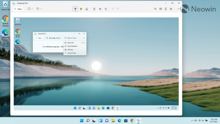
Ah, good old Snipping Tool; one of my most used utilities in Windows 10. And it's actually better in Windows 11 because Microsoft has merged Snipping Tool with Snip & Sketch from Windows 10 in a single and simplistic utility that caters to basic use-cases related to the app. I know that it's not a mind-blowing app but it's one that I use on a daily basis, so I'm glad that Microsoft has merged both its implementations in a single app to offer an enhanced user experience from a functional perspective.
I think it could do with some more features such as a blurring capability and custom countdown timers but it is suitable for around 99% of my use-cases. With both Snipping Tool and Snip & Sketch present in Windows 10, I used to be on the fence about which app to use. The former covered most of my use-cases but the latter offered a better user interface with more functionalities. With Windows 11, I don't have to worry about this. I think my love for Snipping Tool compares to ZDNet's Mary Jo Foley's undying love for Notepad. Check out more of my thoughts on Snipping Tool here.
4 - Windows Update
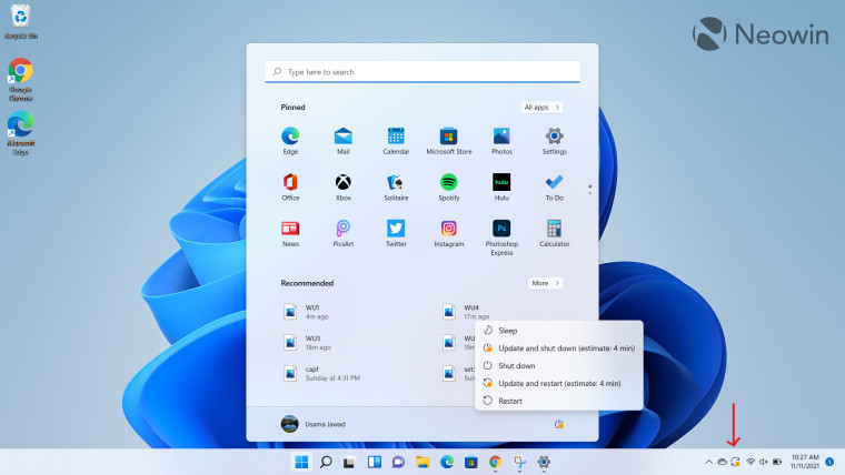
While the Windows Update user interface in Windows 11 hasn't been rebuilt from the ground up, it packs a couple of very nice improvements that improve the overall user experience for me. One of those is that it shows how long it will take for an update to install, which is something that I sorely miss when I use Windows 10. It shows this information both in the Windows Update section as well as the Start menu, making it really easy to decide if you want to install the update or not.
Talking about the Windows Update section, it has received a minor but decent redesign as well. It has been organized in a much better way and it's easier to find the stuff you're looking for. Microsoft now provides more information at a single glance without requiring you to scroll and without cluttering the screen needlessly. It's a significant step up from the Windows 10 implementation that wasted a lot of space for no good reason.
The backend has received improvements too. Microsoft uses a technique called reverse update data generation to reduce the size of Windows 11 updates by 40% which also means that updates install faster. If you're bothered by Windows updates and are unsure whether you have the time to install them, you should definitely consider Windows 11 as an upgrade option when it becomes available to you. Read more of my views on Windows Update in Windows 11 here.
5 - Settings UI
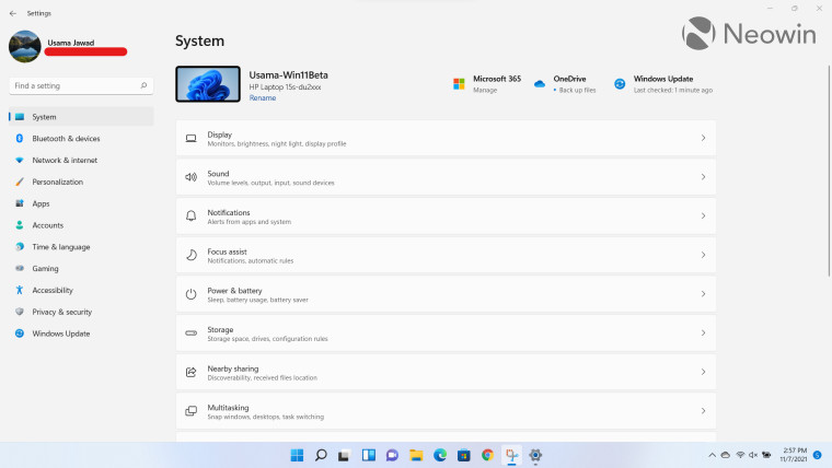
I realize that this may be a controversial choice because the Settings app is so vast and Microsoft hasn't nailed down all aspects of it. In fact, it still has some coupling with the Control Panel even though it's somewhat redundant in a lot of aspects. Still, what I like about the Settings app is it's overall UI.
The breadcrumbs design is neat and allows you to quickly navigate between pages instead of having to go back to the landing page of the Settings app each time, like in Windows 10. In fact, the Settings app in Windows 11 doesn't even have a traditional landing page. Microsoft has just set the System page as the landing page for the app and shifted all the core settings to the left pane, as you can see in the screenshot above. What this means is that you always have access to the core settings at your fingertips and can couple that with the breadcrumbs to jump between sub-settings with ease. This is something that was just not possible in Windows 10 and really hampered my workflow.
Thankfully, Microsoft has resolved a lot of the problems of the Settings app in Windows 11 and while it may not be perfect yet, I think that the company is on the right track. I have high hopes that it will get better with time and we already know that work is underway to add more functionalities to it. You can read more of my thoughts on the Settings app UI here.
Have you started using Windows 11? What are your favorite features? Let us know in the comments section below!


56 Comments - Add comment