If you’re familiar with Microsoft’s Lumia devices – and those of Nokia before it – one look at the latest additions to the range will hardly raise an eyebrow at first glance. But as the company explained during its big launch event today, there’s a lot more to two of these three new handsets than meets the eye.
Today’s event offered only a brief opportunity to go hands-on with the various devices that Microsoft announced, and it would obviously be inappropriate to judge any of them completely until we’ve had a chance to put them through their paces in a full review. But of course, we can - and will! - share some of our first impressions of each device.
Lumia 550

While queuing for the event, a few of the assembled journalists outside the event discussed whether or not the 550 might make an appearance today. The broad consensus – perhaps unsurprisingly – was: “who cares?” And indeed, the announcement of the 550 today was so brief and fleeting that even Microsoft appeared indifferent to its arrival.
Honestly, I was bored of the 550 as soon as I picked it up. It looks like many other low-end Lumias, it has pretty low-end specs, and it lacks some of the higher-end features in Windows 10 Mobile, such as Phone Continuum.

Still, the phone felt solid and well built, and brought to mind both the Lumia 540 and Lumia 635 in its design and construction. It breezed through the OS fairly effortlessly – although that’s certainly to be expected of a brand new device with only a handful of apps pre-installed.
The only really interesting thing that I found on the device was that it was running a Threshold Wave 1 (TH1) build of Windows 10 Mobile; specifically, build 10240, labeled as a “Windows 10 Mobile Insider Preview”. However, when I attempted to take a photo of this screen, I was told off by a Microsoft staffer who really didn’t want me capturing that on camera...!
Lumia 950 and Lumia 950 XL

Like the 550, the new flagship Lumias will be immediately familiar to anyone who’s seen one of Microsoft’s Windows Phones before. I have personally been criticizing Microsoft for some time for its unimaginative, ‘same-again’ approach to handset design, and the many leaks of the two devices in recent weeks had me rolling my eyes at how bland they appeared.
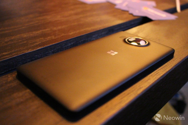
The Lumia 950 and 950 XL look marginally better in the flesh, helped considerably by the attractive detailing on the reverse of each device. They proudly feature the Microsoft logo on the rear, minus the wordmark, along with distinguishing design details around the camera module.
The bodywork feels very nice to the touch - almost luxurious - and as with the 550, both flagships felt very well built. The 950 XL will no doubt be a bit too big for some to hold comfortably in one hand, but the 950 felt just about right for my hands. (This was similar to my experience with the Lumia 640 and 640 XL - the larger handset simply felt a bit too big at times.)
Both the Lumia 950 and 950 XL look handsome, but they also look fairly ordinary alongside the likes of Samsung’s distinctive Galaxy S6 edge, or even a new iPhone.

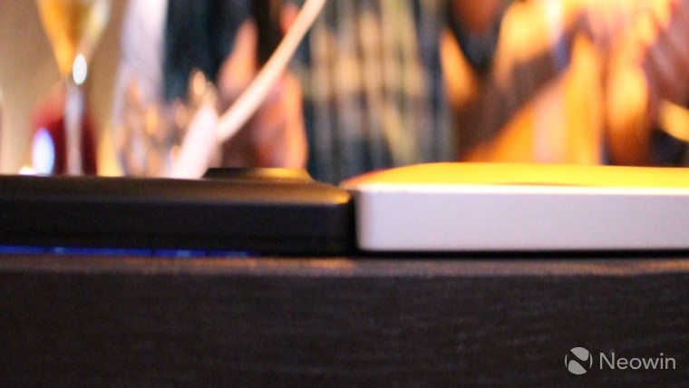
The 950 and 950 XL both feel surprisingly light – especially if you’re more accustomed to heavier or bulkier devices in the flagship-class. I was immediately taken aback by how light the XL was compared with my Lumia 930, despite having a larger screen and being packed full of even newer tech. As you can see in the image below (with my apologies for the slightly dodgy focus), the XL is also noticeably thinner than the 930/Icon. Impressive on both counts, especially when you consider the broader range of capabilities that the new devices offer too, with features like Phone Continuum.

Like the Lumia 550, the 950 and 950 XL were both running Insider Preview builds of Windows 10 Mobile. Unlike with the 550, I was able to get away with snapping a pic of the About screen on both devices. The Lumia 950 XL was running build 10.0.10240.16534.TH1_ST1_EEAP(wpbldlab).20150914-2251:

The smaller 950 was running a different build – 10.0.10546:
Microsoft declined to tell me – on or off the record – exactly which build will be lined for release on these devices, but those I spoke to made it clear that all three handsets will be shipping with different builds to those seen on these demo devices. This pre-release software was likely to blame for some less than impressive performance from the Lumia 950.
For example, in the couple of minutes that I played around with the 5.2-inch device, two apps crashed and dumped me back to the Start screen. I tried out the camera – not so much to test the quality, but the speed of the app – and I was appalled at how slowly the device processed the images to present them to be viewed in pixel-perfect glory. 4-5 seconds per picture of staring at “adding the finishing touches...” before your photo is ready to view properly is not an impressive imaging experience.

However, I can’t judge Microsoft too harshly for not having everything working perfectly on a preview OS build. But some may well wonder why the OS still isn’t ready, forcing the company to show off its latest and supposedly greatest devices with half-baked software.
So as first impressions go, the Lumia 950 and 950 XL didn’t exactly manage to wow. But while superficially, the two devices aren’t terribly exciting – and the unfinished software doesn’t help things – beneath the surface, both devices look set to offer an impressive user experience thanks to the well-integrated Windows 10 ecosystem, and some of the new features that the latest OS brings.
Display Dock for Phone Continuum
_story.jpg)
I got a quick demo of Phone Continuum working on the Lumia 950 XL, and in practice, it worked flawlessly. Simply connect the handset to the Display Dock, along with your mouse and keyboard, and then hook up the Dock to a TV or monitor, and within a couple of seconds, you’ll be using your phone like a mini Windows 10 PC.
The Display Dock is surprisingly heavy – indeed, I had a brief ‘wtf’ moment when I went to pick it up, expecting some lightweight plastics. In fact, it’s metallic and surprisingly weighty. The reason? Microsoft didn’t want it sliding around all over the place while you’re using your mouse/keyboard or phone, so the weighted design helps to ensure that it stays in place on your desktop.
_story.jpg)
The Display Dock feels extraordinarily solid – it feels like a very high quality product indeed – and it appears to work very well in practice too. Beyond the speedy setup, it also streamed 1080p video flawlessly, and there was no lag or latency while typing or moving the mouse.
Earlier this year, I explained why Phone Continuum is such a big deal – indeed, it represents a massive push into a truly ‘mobile-first’ future for computing from Microsoft. From what I’ve seen today, that feature is still immensely exciting, and to see it working in the flesh (even on pre-release software) has left me itching to try it out in the real world.
Whether or not consumers are wowed by that feature remains to be seen – a couple of Microsoft reps at the event today quietly conceded that consumers probably won’t be swayed by the new feature, but it’s expected to be a very big draw for business and enterprise customers.


33 Comments - Add comment