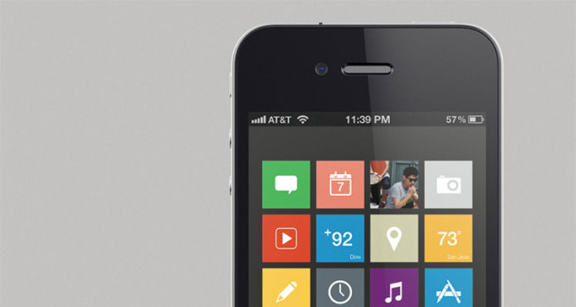
Over the past few months, there have been several conflicting claims about the redesign, or not, of iOS. First, the Wall Street Journal published an article claiming the changes would be "pretty conservative," then in a conversation on Branch, many Apple heavyweights claimed that they'd heard that the changes would be significant.
A new report by 9to5Mac has yet more information about the upcoming revision, which is expected to be released at WWDC 2013. 9to5Mac cite "multiple people who have either seen or have been briefed on...iOS 7" who claim the new interface and general design will be "very, very flat." Other sources claim the general design "loses all signs of gloss, shine and skeumorphism" which are currently found in iOS app such as Calendar and Game Centre. According to 9to5Mac, the new version of iOS takes after the "Metro" design language that is prevalent in Windows 8 and Windows Phone.
"Flatness" is, according to the report, the reduction of unneeded textures or miscellaneous design features that currently adorn iOS. Jony Ive, who now heads up the iOS design team, is a staunch supporter of minimalistic designs, which is echoed in his other works, such as the iPhone, iPad and iPod. The new design will align the "entire system," hinting at a redesign of all the core apps, and a movement from skeumorphism.
iOS will, however, retain it's easy-to-use status. People who have used the new OS told 9to5Mac that there is "no new learning curve" to iOS 7, and the core apps and "fundamentals" remain the same. iOS 7, which is codenamed "Innsbruck," will introduce a whole new set of icons as well as "newly designed tool bars, tab bars, and other fundamental interface features across the system."
Apple may even be looking into widgets for iOS 7. According to the report, Apple is looking into "more 'glance-able' information" that could be implemented via "new panels [that] swipe from the left and right side of an iOS device's display."
Source: 9to5Mac | Image via MacRumors


124 Comments - Add comment