Today at Microsoft's Build 2018 developer conference, the company held a session called Fluent Design: Evolving our Design System. There, the firm announced what's coming to Fluent Design throughout the year, as well as what's new in the Windows 10 2018 Update.

One thing that's new is called command bar flyout. This is meant to show you tools and options inline with what you're working on, rather than in a ribbon at the top of the screen, which takes up valuable real estate.
Remember, Fluent Design is all about one design system that works across all devices, including 2D and 3D, and including PCs, phones, tablets, HoloLens, VR, and anything else. It's not all about fancy blur effects and Reveal highlights.
The first app to use the command bar flyout will be OneNote, and in fact, OneNote kind of stole the show.

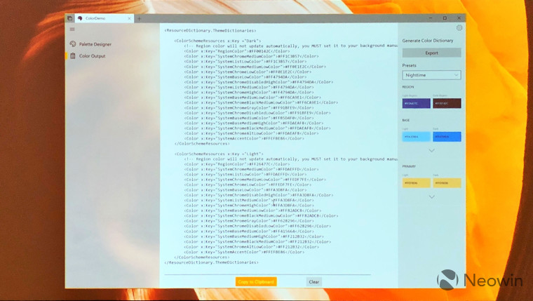
Another new feature is z-depth, and shadow effects. Microsoft pointed out during the session that it previously flat, with a limited color palette. This is also why it's bringing a new way of managing colors in apps.

Rather than having to manage each control's color separately, you'll be able to manage your brand easier with better color management.

There is one new Acrylic feature though, which is transient UI. These mostly include pop-up menus, which will now have a layer of transparency. This does not include pop-ups that have to be manually closed.

There are also some changes to the navigation guidelines. Microsoft no longer wants developers to count on the back button that's included. Instead, the back button will be as shown in the image above.

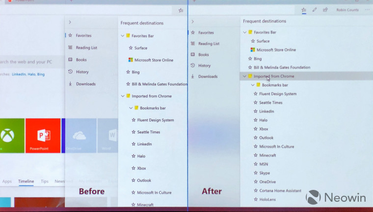
But perhaps we buried the lede here, because potentially the most important design change is different sizing. When the Universal Windows Platform first launched, apps were designed with touchscreens in mind, offering larger controls for a touch-first interface. Unfortunately, this is clunky for those that use a mouse and keyboard, so now Microsoft is offering standard and compact views.
As you can see from the image above, the app will adapt based on what type of input and what type of device that you're using. This should solve a serious pain point in UWP apps.

As you can see, there's quite a bit more coming to Fluent Design than there was last year. The full session will be posted on the Microsoft Build website soon, so if you're interested, make sure to check it out.


65 Comments - Add comment