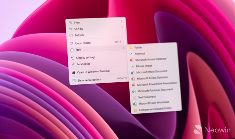
Microsoft is actively tweaking the User Interface (UI) of Windows 11 to bring it in line with the WinUI design aesthetics. In the latest Windows 11 Build 25115, the Shut Down dialogue box as well as the WinRE have undergone a facelift.
When Windows users press Alt+F4, a shutdown options dialogue box appears. The shutdown box in Windows 11 currently looks identical to the one present in Windows 10. Microsoft has tweaked the appearance of the “Shut Down Windows” option and given it a more modern look.

The shutdown dialogue box includes a drop-down menu giving users the choice to hibernate, shut down, restart or standby their PC. All these options look slightly different in Build 25115. Microsoft is trying a slightly updated interface for the famous Alt+F4 dialog. The revamp replaces the traditional Windows logo with a cleaner look. However, the tweaked shutdown dialogue box in Windows 11 ironically looks similar to the dialog from the Windows 95-era.
With the introduction of Windows 11, Microsoft has been actively adding WinUI elements like Mica to various aspects of the operating system. The Shutdown dialog seemed to have missed the transition, but the latest build activates the new look. Currently, Mica applies to the Windows apps title bar only and Fluent Design is also missing.

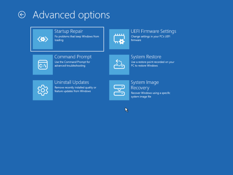
Apart from the Shutdown dialog box, Microsoft is also testing WinUI and Fluent Design icons for WinRE (Windows Recovery Environment). Windows 11 still has a Windows 8-era WinRE interface, which appears outdated in the modern OS. Microsoft recently replaced most of the icons in WinRE with new ones.
While these aren't huge changes, they indicate Microsoft is serious about ensuring consistency in various design elements. Although the cosmetic changes in the latest build available in the Dev channel are in line with the rest of the OS, there’s no assurance Microsoft will retain them in Windows 11 23H2.
_small.jpg)
_small.jpg)


24 Comments - Add comment