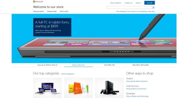
Microsoft may be opening a bunch of new retail store locations over the next several weeks, but the company also knows that tons of people prefer to shop online. On Friday, Microsoft quietly launched a new and almost complete redesign of the Microsoft Store website for some online browsing pleasure.
Visitors to the Microsoftstore.com URL will immediately notice that the site now has much bigger images that take up almost the entire width of the web page for their "hero" carousel. Gone are the smaller images placed on the right side with a column of shopping categories placed on the left

The old design, which put a big emphasis on categories
Indeed, the new layout's front page does away with that column completely. Instead, you scroll down to see images from the top categories on the site (Computers, Xbox 360 and Office), with a link to a page where you can see all of the site's shopping sections. There's also a "What's New" selection on the front page and more.
Overall, the new design is a big step up from the previous website and far more pleasing to the eye. The site also currently has some special sales on Windows 8 PCs, including price cuts of between $300 and $350 on different models of the Acer Aspire S7 touchscreen notebook, and saving $50 on a Lenovo ThinkPad Tablet 2, plus a $100 coupon.
Source: Microsoft Store | Images via Microsoft


9 Comments - Add comment