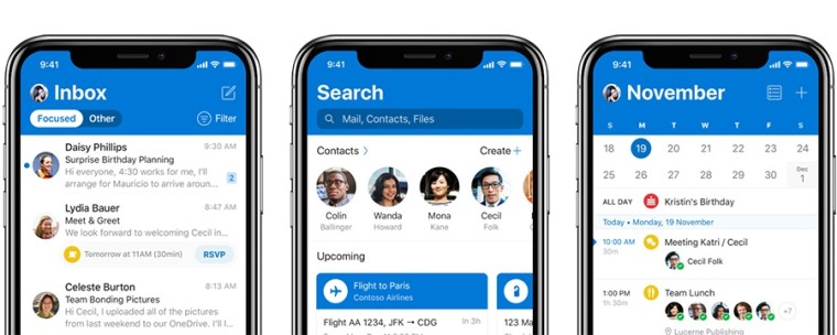
Microsoft has announced that it's begun rolling out a new experience for Outlook mobile users on iOS. The new app emphasizes its design choices to make the app "delightful" to use and to help it distinguish itself from other apps.
For starters, it now adopts the same blue header you're used to seeing on other versions of Outlook instead of the typical white headers used in iOS apps. Microsoft says this helps users identify Outlook more easily when switching between apps. At the same time, the app uses native typography and fonts, so that it still feels like an iOS app.
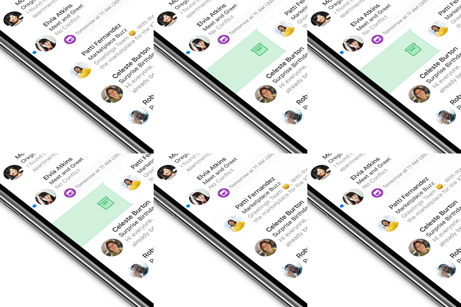
Animations and adaptivity are also a big part of the new experience. For example, the big and bold header will shrink when you scroll down your inbox to make room for the more important content. There are are also subtle new animations throughout the app, such as when you swipe to interact with a specific message in your inbox.
Other design changes include an avatar icon in the app header so you can identify your account, as well as indicators to help you switch between accounts if you use more than one. Avatars are also displayed next to messages in your inbox so you can more quickly see who's talking to you.
 Event scheduling has also been made easier, and it's now possible to schedule a meeting with your team without typing a single word. The experience brings forward the relevant people, places, and dates for the context you're in so that you can more easily find a spot in the calendar as you swipe through it.
The Outlook update for iOS begins rolling out today, but it won't be available to everyone immediately. The app will be one of the first to receive an updated icon as part of the redesigned Office icons which were revealed last week, too, but it's unclear if that's part of today's update. If you'd like to give it a go, you can download Outlook for iOS from the App Store.


_small.jpg)


12 Comments - Add comment