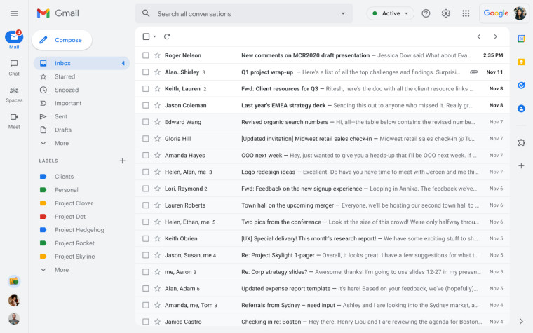
Back in February, we learned that Google is finally updating the ancient interface of Gmail and that the service is getting a Material You redesign that makes it look similar to Outlook. Back then, Google made it an opt-in experience with the option to roll back to the old interface. This meant that it was initially meant for enthusiasts who are eager to switch things around a bit when using Gmail. However, the new interface is set to arrive for everyone pretty soon according to Google's latest guidance.
Starting from today, the new UI will become opt-out rather than opt-in for some users. This means that the redesign will be the default experience for some people, but they will still have the option to revert to the classic view. That said, the opt-in choice will still be present for those who want to try it out.

The idea behind the new Gmail is to offer an integrated view that allows you to quickly access other Google apps like Chat and Meet directly from a single interface. As can be seen in the screenshot above, applications are neatly tucked away in the left pane whereas options for labels and emails are now shown in full next to them too. With the applications being in their new position, you don't need to switch between tabs or windows in order to use Chat or Meet, you can do that directly in the same browser window. Notification bubbles will also be shown for each application. Moving forward, Google will offer a unified search experience so that it shows results from integrated applications such as Chat too.
That said, you also have the option to decouple other Google apps from the new interface and use the Gmail-only view, if that is what you prefer.
Google had previously stated that new Gmail will become the default view for everyone by the end of Q2 2022 and while it doesn't seem that the firm will hit this timeline, it's clear that the redesign will become generally available pretty soon.


25 Comments - Add comment